
When Websites Seem to Work, But Cost Leads
For many business owners, a website feels like a box that has already been checked. The site loads, the phone number is visible, and customers can find basic information. From the surface, everything seems fine.
The problem is that “good enough” websites often underperform in ways that are not immediately visible. They do not fail outright, but they quietly lose opportunities through small inefficiencies that compound over time. Missed inquiries, abandoned visits, and wasted intent rarely show up as clear red flags, yet they have a measurable impact on growth.
This article explains why websites that appear functional can still carry hidden costs, how those costs accumulate, and why performance, not appearance, is what ultimately determines whether a website supports or limits a business.
Why “It Looks Fine” Is a Common Trap
Most websites are evaluated informally. Owners load the homepage on a desktop computer, scroll briefly, and confirm that nothing appears broken. If the site reflects the brand reasonably well, it is often considered finished.
That standard made sense years ago. Today, it is outdated.
Modern websites are not judged by how they look to the owner, but by how efficiently they guide visitors toward action. A site can look professional and still introduce enough friction to suppress conversions. Because those losses happen incrementally, they are easy to miss.
A website rarely needs to be redesigned because it is “bad.” It usually needs improvement because it is inefficient.
Conversion Rates Are Not Broken, They Are Often Just Inefficient
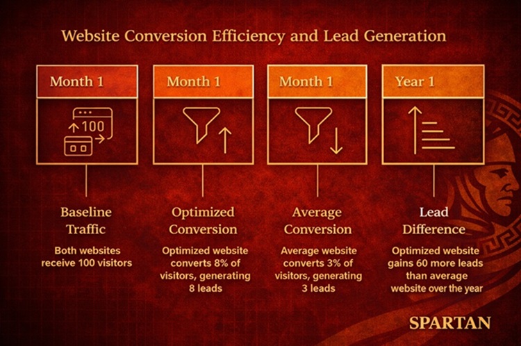
Across service-based business websites, average conversion rates commonly fall between 2% and 5%. That means out of 100 visitors, 95 or more leave without calling, submitting a form, or taking a meaningful action.
Well-optimized websites, by contrast, often achieve upper single-digit or low double-digit conversion rates by reducing friction and aligning content more closely with visitor intent.
The difference between a 3% and a 8% conversion rate may not feel dramatic in a single month. Over a year, however, that gap can represent dozens, or even hundreds, of missed inquiries, depending on traffic levels.
This is where “good enough” becomes costly. The site is working, but it is not working as hard as it could.
The Hidden Cost of Friction
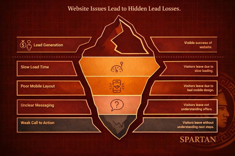
Website friction refers to anything that slows, confuses, or discourages a visitor from taking the next step. Individually, these issues may seem minor. Collectively, they create real opportunity loss.
Common sources of friction include:
- Slow page load times
- Unclear navigation or service hierarchy
- Pages that require excessive scrolling on mobile
- Calls-to-action that are present but not obvious
- Forms that feel long, intrusive, or poorly placed
Each instance increases the likelihood that a visitor leaves without contacting the business. That departure is rarely noticed in isolation, but when repeated across hundreds or thousands of visits, the impact becomes significant.
Mobile Is Where “Good Enough” Breaks Down First
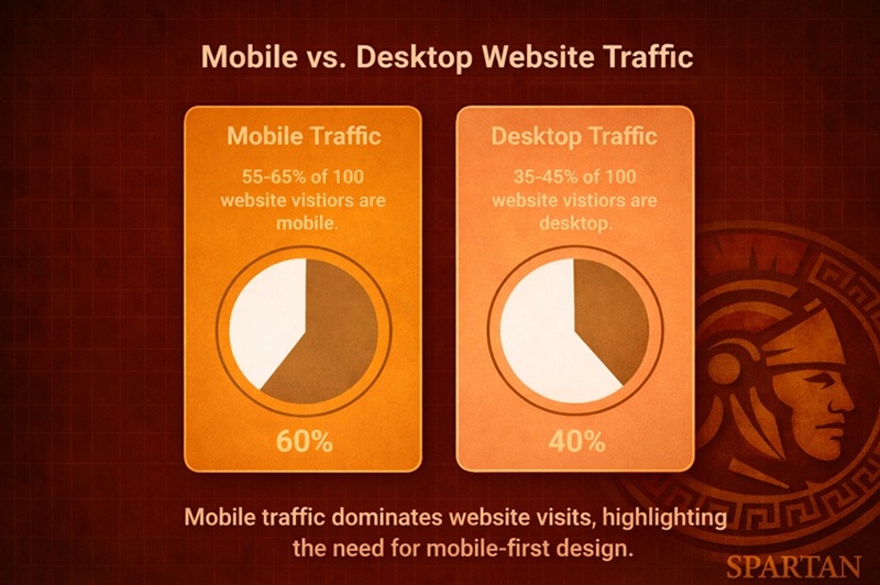
For most businesses, the majority of website traffic now comes from mobile devices. Depending on industry and location, mobile users often account for roughly 55–65% of visits, while desktop traffic makes up the remainder.
Despite this shift, many websites are still designed and reviewed primarily on desktop screens.
Mobile users behave differently. They scroll faster, tolerate less friction, and are more likely to abandon a site if information is hard to find or actions require extra effort. A layout that feels acceptable on desktop can become frustrating on a phone if buttons are too small, content is poorly stacked, or key information is buried.
A common pattern emerges:
- Desktop experience: acceptable
- Mobile experience: compromised
- Overall performance: quietly suppressed
When owners say, “The site looks fine,” they are often describing only part of the experience.
Why Paid Traffic Suffers the Most
The hidden cost of website inefficiency is most apparent when traffic is paid for.
Advertising brings high-intent visitors to a site. When landing pages are unclear, slow, or poorly structured, that intent is wasted. In many cases, businesses respond by increasing ad spend or adjusting campaigns, assuming the issue lies with traffic quality.
Often, the real issue is the page itself.
Even modest improvements in page clarity, speed, and call-to-action placement can significantly increase the return on existing ad spend. Without those improvements, “good enough” pages quietly drain marketing budgets.
How “Good Enough” Websites Undercut SEO Over Time
Search visibility is influenced by more than keywords and backlinks. User behavior plays a role in how search engines interpret relevance and usefulness.
When visitors land on a page and quickly leave, fail to engage, or do not take action, those signals suggest a mismatch between search intent and page experience. Over time, this can limit a site’s ability to perform as well as competitors with stronger engagement.
This is why SEO and website performance are not separate concerns. A site that technically ranks but fails to satisfy visitors is less likely to sustain strong visibility long term.
“Good enough” sites often rank below their potential, not because content is missing, but because engagement is weak.
What High-Performing Websites Do Differently
Across industries, websites that consistently convert well tend to share similar characteristics. These are not design trends or tools, but structural patterns.
High-performing sites typically:
- Guide visitors along clear service-specific paths
- Match page content closely to user intent
- Prioritize mobile usability
- Make contact options obvious and easy
- Reduce distractions that compete with primary actions
None of these elements require radical redesigns. They require intentional decisions about how the site should function, not just how it should look.
Reframing the Question Business Owners Should Ask
The most useful question is not whether a website looks professional or modern.
The better question is:
Is the website doing the job the business expects it to do?
A site that looks fine but underperforms is not neutral. It carries opportunity cost. Over time, that cost shows up as slower growth, lower marketing efficiency, and increased reliance on paid channels to compensate for weak conversion performance.
Recognizing this gap is the first step toward fixing it.
Data Sources & Methodology
This analysis is based on:
- Cross-industry website conversion rate benchmarks for service-based businesses
- Observed differences between average and high-performing websites
- General mobile vs. desktop usage trends across business websites
- Established principles of user behavior, conversion efficiency, and search engagement
All figures are presented as directional benchmarks intended to illustrate relative performance differences, not guarantees or forecasts.